From Clunky Flows to 22% Faster Completion

From Clunky Flows to 22% Faster Completion

From Clunky Flows to 22% Faster Completion

Helping researchers collect better data at scale

Team

Vincent Vein (UX consultant)

Vincent Vein (UX consultant)

Duration

28 Weeks 2023-2024

28 Weeks 2023-2024

Role

I was responsible for the end-to-end design process, from UX research to UX design and UI.

Overview

This project supported a cross-country study led by the Digital Life research group, focused on using technology to improve health outcomes for people at retirement age.

Objectives

The main objective was to identify and to address usability issues to enhance user experience and satisfaction. The existing prototype had significant usability issues that threatened the viability of the research.

Impact

⏱ 21% lower average Time on task
📈 ↑ 28% higher SUS score in post-pilot evaluation
🌍 3 Pilot studies conducted across Europe
✅ 43 Participants engaged in the pilot

Methodes
  • Heuristic Evaluation

  • Usability Tests

  • User Feedback Sessions

  • Prototyping

  • User Flows

  • Design Library

  • UX Questionnaire

  • Focus Group

Industry

E-Health, B2B, B2C

Duration

28 Weeks 2023-2024

Team

Vincent Vein (UX consultant)

Introduction

Introduction

Introduction

Introduction

This project was developed by an academic research group (B2BC) funded by grants, within the field of digital public health.

It supported a European cross-country study focused on using technology to improve health outcomes for people at retirement age.

As populations age globally, creating digital tools that empower older adults while generating meaningful data has become both a healthcare priority and a societal challenge.


social activists

Insurance companies

Rehab Centers

Hospitals

Suppliers

Media

Scholars

Indirect stakeholders

Indirect stakeholders

Doctors

Municipalities

The government

SCI Families

SCI patients

direct stakeholders

direct stakeholders

SCI Partners & Caregivers

core Stakeholders

core Stakeholders

Context

Context

Context

Context

This study's research tool (native mobile app) was hard to use and not engaging, leading to low retention and threatening the reliability of the entire study.

The tool's current version undermines user retention, data quality, and trust, ultimately threatening the reliability of the entire study and potentially jeopardizing funding.

"The partner had to cope with the shock, support the injured partner during the institutionalized rehabilitation, and struggle to make their relationship and life together function again."

"They were struck by the brutal fact that their partner had been seriously injured, and their own needs faded into the background."

"The partners experienced much distress and appreciated the support they got but felt that they were mainly left to manage the difficult process on their own."

(Johnson et al.)

Problem

Problem

Problem

Problem

User and stakeholder feedback from the previous studies before I joined the team showed high rates of dissatisfaction with the tool.

Many older users struggled to navigate or stay engaged with the app. It wasn’t intuitive, wasn’t motivating, and didn’t match the needs of its audience.
The flow was super lengthy with lots of redundant steps and friction, leading to frustration and lost interest in committing to the study participation.


Discovery

Discovery

Discovery

Discovery

The organization’s success depends on producing credible, publishable research outcomes that can influence policy, drive innovation, or inform future interventions.

The app I worked on was central to one of the research group's flagship studies; it delivered behavioral interventions and collected health data from older adults over time. Though not built for profit, it played a strategic role in advancing the group’s mission, supporting research outcomes, building trust, and securing future partnerships.

User's Say

User's Say

User's Say

Due to time constraints and the critical step of the project the development was at, I conducted a heuristics evaluation at first.

and then complemented the findings with 5 usability tests on the app's early version

What Users Say

What Users Say

What Users Say

Conducting 5 usability tests, we discovered the painpoints of the users that validated some of the issues found in the Heuristics Evaluation.
Demographics

Number of participants: 5

Age range: 60 to 75 years old

Average age: ~67 years

Gender : 3 Female, 2 Male

Tasks

Task 1: Set 2 goals in the application.
Task 2: Tell me your plans for 3 days from now.
Task 3: Change one of the goals you have.

Task 4: Find where you can see the reports.
Task 5: Log out of your account, please.

  • How was your experience using this application?

  • Have you ever used an application to build new habits regarding your diet or physical activity? Name them.

  • How do you think an application can help you build new habits?

  • Do you have any suggestions that might help us improve this application?

Results

All the participants felt trapped when forced to complete all the steps before finalizing their goal-setting in the app.

3 out of 5 participants reported that they felt overwhelmed after using the application.

80% of users found the app too serious and "businesslike" and didn't like the visuals.

80% of the testers said they were dissatisfied with their experience and would not recommend it.

Strategy

Due to time constraints and the critical step of the project the development was at, I conducted a heuristics evaluation at first.

and then complemented the findings with 5 usability tests on the app's early version

Legibility

Legibility

Legibility

Font size, colors, and text spacing have a significant effect on the rate of accuracy of a visual search and the reaction time during each search period.

When designing the information, on-glance legibility was an important thing to consider, as the surgeons, doctors, and nurses would use the screen as a fast means of retrieving information. Their attention is limited, so the cognitive load had to be minimal. High contrast was used to display quantitative physiology data such as HR and SpO₂ numbers.

The dark background is scientifically proven to have better results when paired with high-contrast colored numbers. Each physiology indicator was assigned a color based on conventions observed through patient monitoring systems. A proper font and size balance was also achieved by using a bold Helvetica weight commonly used with modern patient monitoring systems.

Technicalities

Technicalities

Technicalities

Technicalities

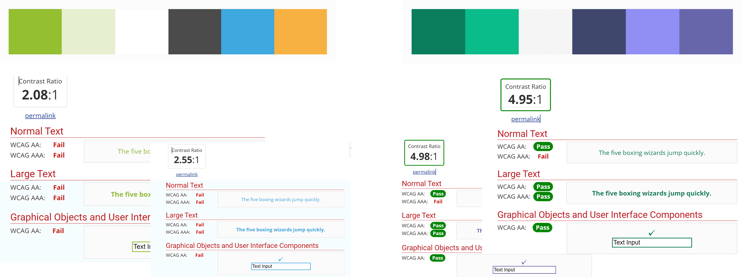
Accessibility as my design pillars, I looked into the suggestions provided by literature in the context of elderly & readability.

Choosing the right font for the screen, the proper colors for backgrounds and texts, and their sizes were defined through this step

Choosing the right font for the screen, the proper colors for backgrounds and texts, and their sizes were defined through this step

Old vs. new pallete

Old vs. new pallete

User Perception

User Perception

User Perception

The role of human and clinical judgment in our AI feature was heavily criticized.

User testing revealed how our product was perceived positively by medical personnel. Most claimed to understand what it does, and what it aims to solve. However, the AI prediction concept was underdeveloped, as many did not understand the need for it, let alone how it worked.

Navigation in Planning Flow

Navigation in Planning Flow

Navigation in Planning Flow

Navigation in Planning Flow

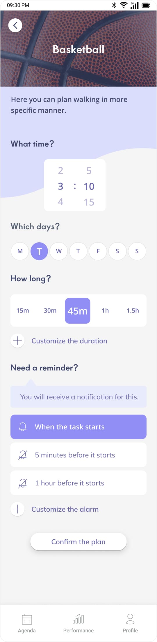
As the previous flow made confusion lacking a navigation while choosing goals, I came up with the idea of adding another layer of navigation bar to the flow.

Top bar Navigation The other introduced feature was to allow the user to scroll between all their plans.

Top bar Navigation The other introduced feature was to allow the user to scroll between all their plans.

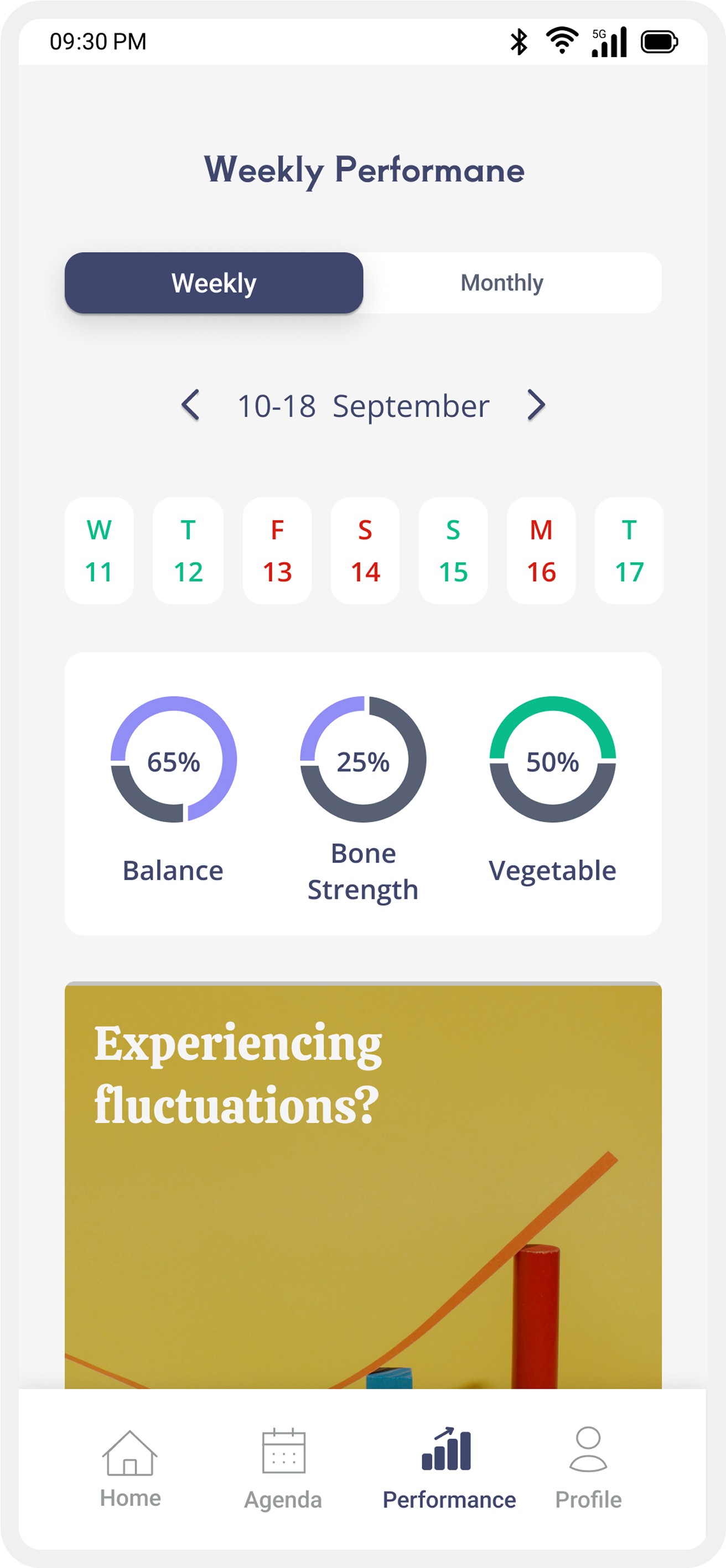
Introducing an overview

The interface

The interface

Feedback sessions underscored the importance of designing with inclusivity in mind, ensuring the app was accessible and relevant across different cultural and linguistic backgrounds.

Feedback sessions underscored the importance of designing with inclusivity in mind, ensuring the app was accessible and relevant across different cultural and linguistic backgrounds.

Revising the main flow

Revising the main flow

Revising the main flow

Revising the main flow

Usability tests showed It takes, on average, 21 minutes for a user to complete the primary task (planning goals), leading to higher drop-off rates. Severity: High

My goals were:

  1. To design a straightforward flow for activity planning.

  2. To provide the flexibility to pause and resume tasks within it.

Enhancing The Visual Appeal

Enhancing The Visual Appeal

Enhancing The Visual Appeal

Enhancing The Visual Appeal

Due to the feedback from the testers, they found the interface messy, boring and government-like.

My goals:

  1. Enhance appeal while preserving user-friendliness.

  2. Making the application more vibrant and fun

  1. Design Library

I brought coherency and style to the interface by the use of components that I designed. To stick to the industrial conventions, I used Google Material Design 3.

The design library

  1. Patterns

Comparing different patterns and colors and picking the right vibe for the application was a must due to the feedback of the testers, who called the interface boring and government-like.

Brainstorming on the visual patterns

  1. Adding visuals

Lack of images or illustrations was one of the insights coming from our research phase. That made us believe we could benefit from communicating through images in a more pleasing way.

Introducing more visuals to screens to give them a more lively vibe

Feedback: What Do You Think Of Visuals?

After preparing the figma prototype, I had it tested with more users and gathered insights and feedback.

After preparing the figma prototype, I had it tested with more users and gathered insights and feedback.

  • Looks Good, Pleasing, Friendly Application

  • I Like It Sort Of Modern Light Presentation

  • Colors Are Soft And Well Chosen

  • Font: Large Enough

  • Light, Open, Clear In Three Words

  • Likes The Icon Styles

  • Looks Really Nice, Fantastic

  • Colorful Enough, Stylish

  • Font Well Readable

  • Nice Color Coding In Movement & Diet Planning

  • Spaced Nicely

Mitigating Drop Offs

Mitigating Drop Offs

Mitigating Drop Offs

Mitigating Drop Offs

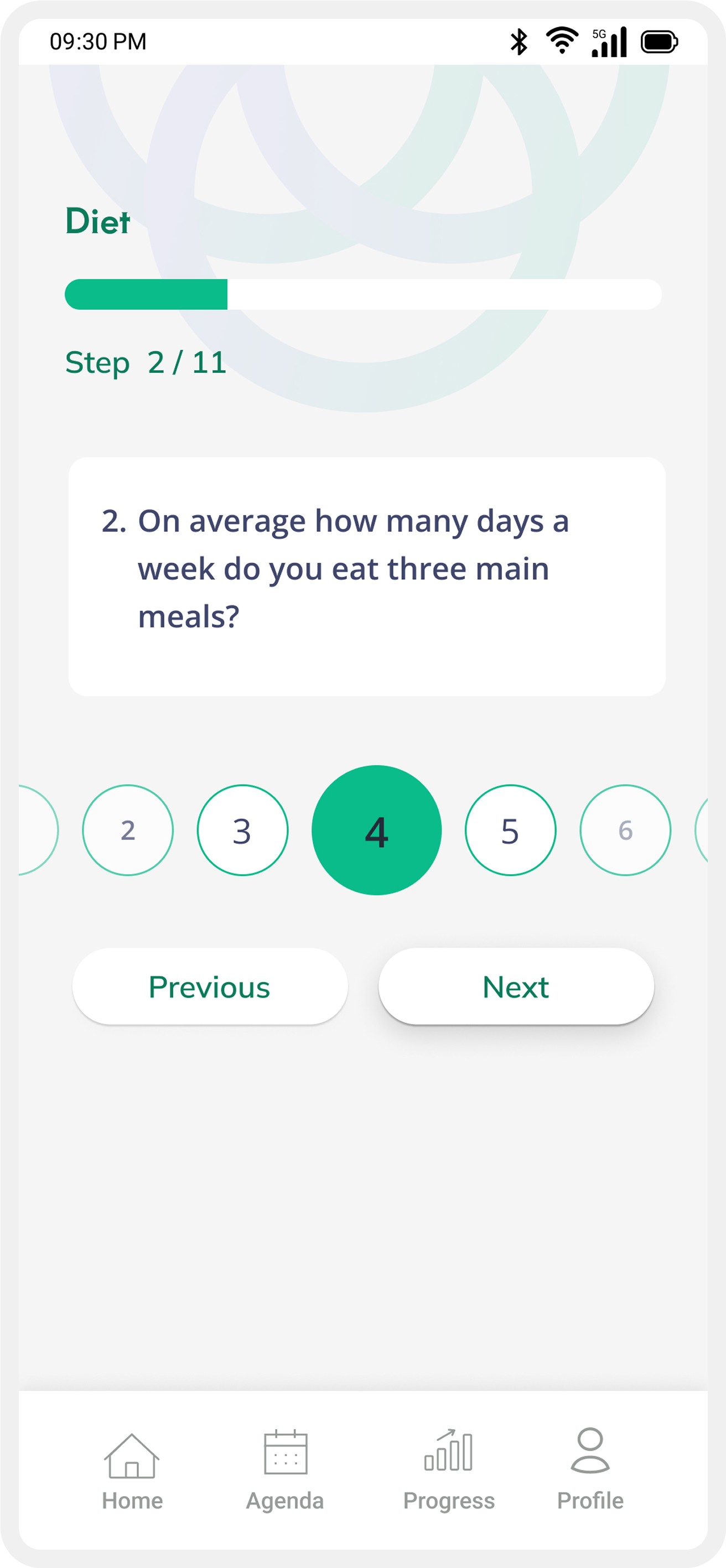
The user's first impression was to fill out three lengthy intake forms without the freedom to skip and get back to them later. Users find it overwhelming which led to form abondonments and drop offs.
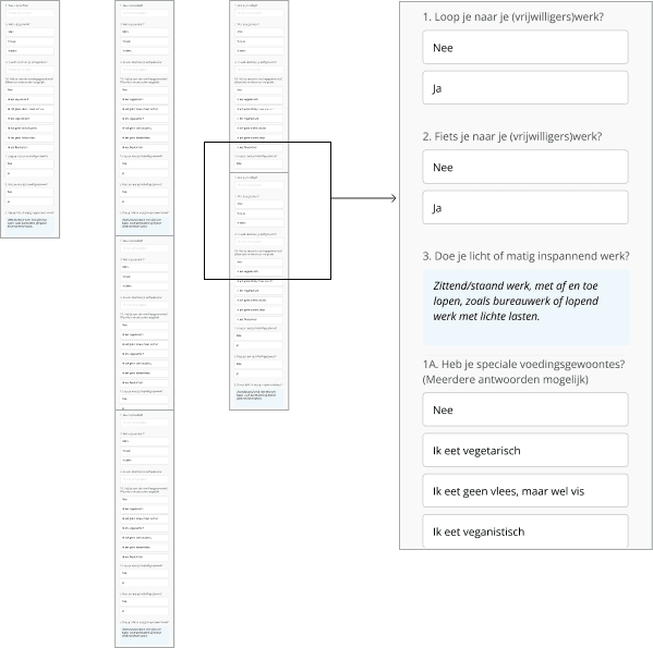
I made them into multiple step forms with features for managing it.
My goals where to

  1. Giving the users the needed freedom

  2. Making the form more intuitive

I made them into multiple step forms with features for managing it.
My goals where to

  1. Giving the users the needed freedom

  2. Making the form more intuitive

Old intake form

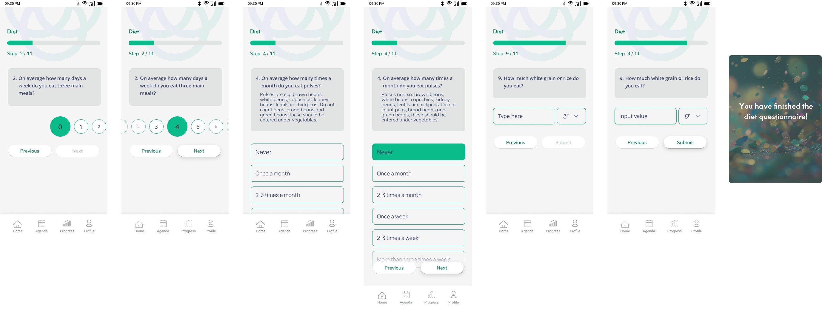
New diet intake form

Simplifying The Reminder

Simplifying The Reminder

Simplifying The Reminder

Simplifying The Reminder

Asking users to set reminders based on their daily activities proved to be unconventional and frustrating for them. Severity: Medium-High

My goals where to

  1. Allow users to customize their reminder schedules entirely.

  1. Make pre-defined reminder times for common events throughout the day, such as breakfast, lunch, dinner.

  2. Giving the users the needed freedom
    Making the form more intuitive

Old and new reminder screens

Second Iteration

Second Iteration

Second Iteration

Conducting another round of user tests with a similar scenario as before, helped me gather insights on our first designed version, leading to iterations on it.

After preparing the figma prototype, I had it tested with more users and gathered insights and feedback.

Missing the starting point

Missing the starting point

Missing the starting point

Missing the starting point

Would a user who has no acquaintance with the concept be able to navigate through the application?

I had my first prototype tested with three participants from the age group and got to know that my initial design lacked a home page! This was a shocking discovery that showed me the value of user tests being done as early as possible in the process of design.

I had my first prototype tested with three participants from the age group and got to know that my initial design lacked a home page! This was a shocking discovery that showed me the value of user tests being done as early as possible in the process of design.

The interface

Feedback sessions underscored the importance of designing with inclusivity in mind, ensuring the app was accessible and relevant across different cultural and linguistic backgrounds.

Feedback sessions underscored the importance of designing with inclusivity in mind, ensuring the app was accessible and relevant across different cultural and linguistic backgrounds.

Still working on the rest of the case study …

Want to know more ASAP?

Solution

Solution

Solution

How we addressed it?
  1. Providing users with Clarity and Control

The new homepage simplifies navigation by placing key financial actions Transfer, Exchange, and Add Money at the centre of the screen.

  • Old Homepage
  1. The homepage was cluttered with "Send Again" suggestions and promotional banners (e.g., "Refer a friend").

  1. Essential features like "Add Money" and "Exchange" were missing from the homepage.

  1. The balance was shown, but with no alerts or guidance for next steps.

❝ Some options feel buried inside menus—I just want to send money quickly. ❞
❝ On PayPal, some options are not clear at all and are not easy to find at first, like adding to my balance or exchange rates when sending internationally. ❞
❝ I have ADHD and I have problems finding options on this app a lot. It takes too long to find what I need, especially when I’m in a hurry. ❞
  • New Homepage
  1. Key payment actions (Transfer, Exchange, Add Money) are prominently displayed at the top, reducing friction.

  1. Alerts provide proactive notifications for users to manage their balance.

  1. The homepage is cleaner, with a focus on transactions rather than promotions.

  • Old Payment screen
❝ I wish I didn’t have to see the profile and photo of people I sent money to once a year ago—it makes it hard to focus on what I need to do.❞
❝ At first, I was really confused about how to do transactions, but after a while, it became easier. It shouldn’t take this long to figure out.❞
  1. The navigation was cluttered, with a mix of frequent contacts and payment options displayed in a less structured way.

  1. The “More Options” section made core actions feel secondary.

  • New Payment screen
  1. We organized options more clearly. Payment actions like "Send," "Bill," "Give," and "Request" are tabbed at the top, making it easier for users to find and switch between different payment methods

  1. Icon colors are changed to reduce distractions, and layout changes help reduce cognitive load.

Still working on the rest of the case study …